
A storage facility website shouldn’t be static. It’s like maintaining a car. You can’t just fill the tank once and expect it to run forever. Treating your website like a “set it and forget it” tool is like skipping oil changes. It works… until it doesn’t.
That’s why Storagely websites are built around continuous evolution, keeping them well-tuned and performing at their best so they continue to attract, convert, and retain tenants as renter expectations evolve.
The goal is no longer having a storage website; it’s about how well that website converts demand into revenue. Conversion is simply how easily someone moves from “I need storage” to “I just rented a unit.” Today’s self storage renters expect speed, clarity, and convenience.
Most modern storage websites now offer online rentals, mobile-friendly design, real-time availability, and basic software integrations. These are what we call “table stakes” features, meaning the baseline capabilities required just to compete, not to stand out. What separates one website from another is how those elements are configured and continuously optimized to convert renters and drive revenue.
How do you ensure your self storage website is optimized to convert?
Let’s take a look.
What Actually Drives Conversions: The Storage Facility Website Elements That Matter
-
Reducing Friction at Every Step
Every extra click, delay, or uncertainty costs conversions. A good storage facility website experience is like a well-lit path that allows you to see every step before you take it. From the moment a lead lands on your website, the UX should make it easy to access facility information, find the right size storage unit, and rent within minutes (or seconds if you have the right website platform).
Some Friction Points Include:
- Slow load times and poor mobile experience.
- Confusing navigation or too many steps to rent.
- Unclear pricing or lack of real-time unit availability.
- Complicated or third-party checkout with too many form fields.
- No instant support or answers (chat, FAQs, guidance).
Individually, these might seem minor. Together, they quietly chip away at rental rates. But which point of friction is the big whale you should be chasing? Your checkout.
Do you want to see the points of friction of your website? Sign up for a free Storagely Website Scorecard and see exactly where your website is losing revenue!
The average ecommerce cart abandonment rate is 70.22%, representing $18 billion in lost annual revenue according to a Baymard Institute 2025 Study.1 A jaw-dropping stat? Yes. However, there is hope.
Baymard’s study showed that $260 billion of that revenue was recoverable through a better checkout flow and design.
Increasing conversion rates is within your reach if you understand why renters aren’t completing rentals.
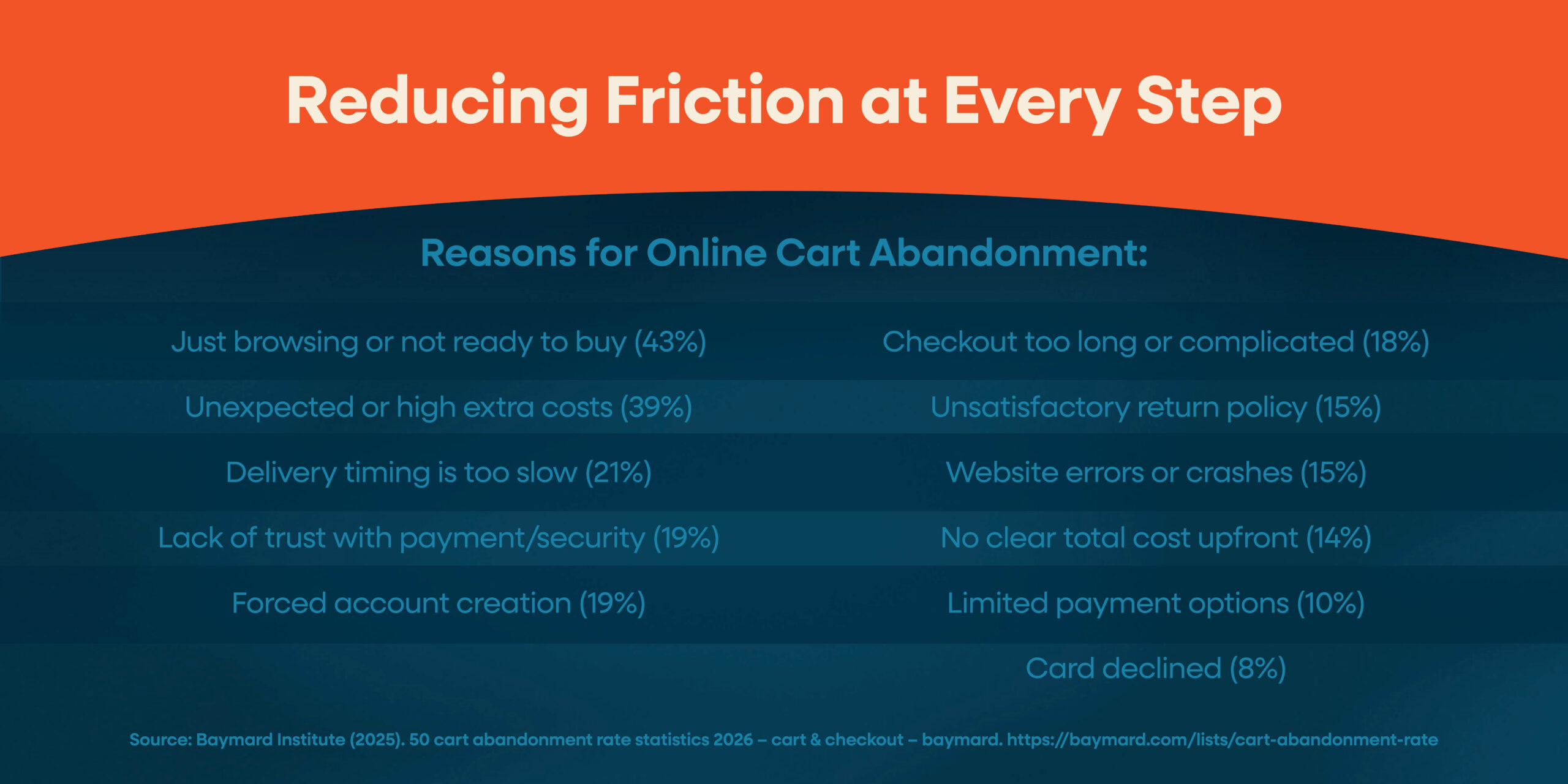
Reasons for Online Cart Abandonment:
- Just browsing or not ready to buy (43%)
- Unexpected or high extra costs (39%)
- Delivery timing is too slow (21%)
- Lack of trust with payment/security (19%)
- Forced account creation (19%)
- Checkout too long or complicated (18%)
- Unsatisfactory return policy (15%)
- Website errors or crashes (15%)
- No clear total cost upfront (14%)
- Limited payment options (10%)
- Card declined (8%)
These stats all point to one thing: most lost conversions happen at the point of decision.
Notice how many of these reasons are tied directly to the checkout experience. High extra costs, unclear total pricing, long or complicated checkout, forced account creation, limited payment options, and even trust concerns all show up right when a renter is ready to take action. That means the interest is already there. The breakdown happens in the final steps.
In other words, your homepage is the important first impression that gets a lead’s foot through the door, but your checkout closes the deal. A streamlined, transparent, and trustworthy checkout flow removes last-minute friction, reinforces confidence, and makes it easy for renters to follow through. Without that, even high-intent traffic ends up walking away right before the finish line.
According to the Baymard Institute, the average checkout flow has 5.1 steps and 11.3 form fields, and 18% of users abandon their purchase due to checkout complexity.3 More importantly, their research found that it’s not just the number of steps that matters, but the total number of form fields and perceived effort. The more a user has to fill out, think about, or second-guess, the more likely they are to drop off.
This is exactly why Storagely self storage websites include a one-page checkout with minimal steps and no third parties. By simplifying the process and reducing effort, renters can move from interest to completion quickly, without unnecessary friction getting in the way.
The best storage facility websites don’t just reduce friction. They anticipate it. They remove obstacles before renters even notice them, keeping momentum intact from the first click to the final confirmation.
-
Meeting Renters Where They Are With Multiple Conversion Points

Most storage websites are built around a single, linear path to conversion. But real renters do not follow a script, and your website shouldn’t act as they do. Storagely’s approach creates multiple, connected conversion points so renters can move forward the moment they are ready, no matter how they got there. Tools like Swivl’s AI chat and the Calcumate Storage Calculator are not just helpful. They are entry points into the rental process.
With Swivl, renters can ask questions, get matched with a unit, and go straight to checkout with their selection and details pre-populated. No “Great choice, now go find it again” energy. Renters can figure out the right size and immediately move into the rental flow with Calcumate. No backtracking, no second-guessing, no opening three new tabs just to be sure.
This is where many platforms fall short. They let renters find a unit in different ways, but not rent it from those same points. Instead, users get sent back to a location page.
A high-performing website connects discovery directly to action.
Renters Should Be Able to:
- Get a recommendation through chat or a calculator.
- See a matching unit instantly.
- Move directly to checkout.
- Complete their rental without restarting.
That is it. No loops. No detours. No digital “Please hold while we transfer you.”
The moment someone finds the right unit is the moment they are most likely to convert.
The question is not whether your website offers multiple ways to explore. It is whether those paths actually lead somewhere, or quietly send renters back to square one with a little less patience than before.
When everything is connected, conversion becomes a natural next step instead of a restart.
-
Recovering Lost Rentals
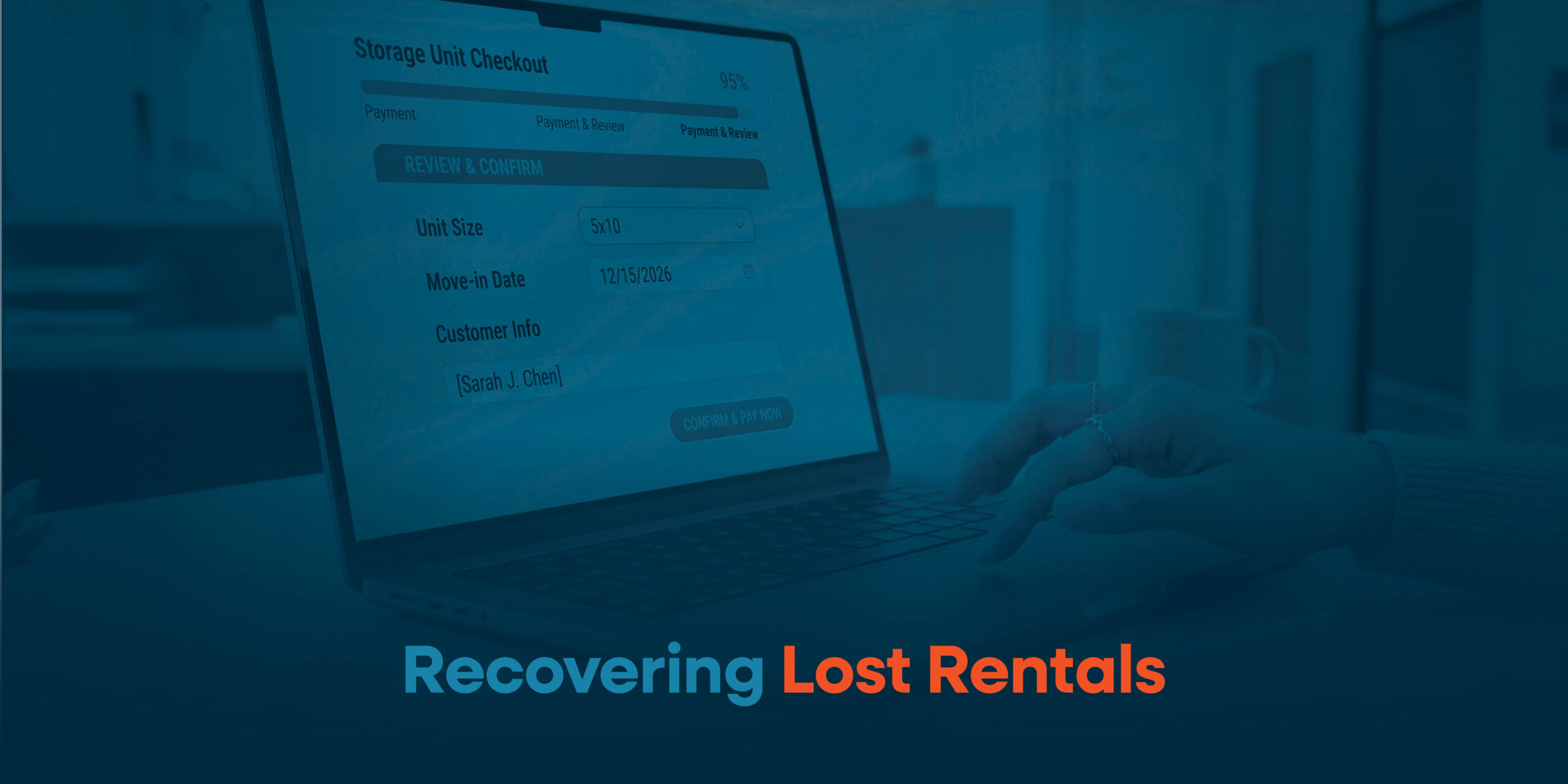
As we’ve established above, not every renter converts on their first visit.
A significant portion of potential renters will start the process and leave before completing it. Without a system in place, those opportunities disappear.
Your storage facility website should be equipped to turn “almost” into revenue by re-engaging renters who showed intent but didn’t finish.
Strategies for Reclaiming Lost Rentals:
- Abandoned rental recovery that brings users back to where they left off.
- Timely re-engagement that keeps your facility top of mind.
- Follow-ups that remove lingering hesitation or unanswered questions about their storage needs.
The key isn’t just reaching out; you have to do it in a way that feels relevant and helpful, not intrusive. A Retainful study found that abandoned cart recovery emails alone can recover at least 10-20% of lost sales.2 Storagely’s abandoned rental recovery feature has seen even stronger results in practice, with Client B, a 25-location storage company, achieving a 33% abandoned rental recovery rate.
At this stage, the renter has already done the hard part. They’ve shown interest. They’ve engaged. They’ve almost converted.
A well-optimized self storage website doesn’t let that interest go to waste. It captures it, extends it, and turns it into completed rentals.
-
Guiding the Renter Journey

Most storage websites present options. The best ones guide decisions.
There’s a big difference between a digital catalog and a conversion-focused experience. A catalog lists units. A high-performing website helps renters choose the right one with confidence.
Your Website Should Help Renters:
- Choose the right unit.
- Feel confident in their decision.
- Proactively answer frequent concerns.
Websites shouldn’t be complicated. It’s all about removing guesswork. Simplifying decisions. Creating a flow where each step naturally leads to the next.
When renters feel confident, they don’t need to leave your site to validate their decision elsewhere. They move forward and complete a storage unit rental.
That’s the difference between browsing and converting.
-
How Pricing and Value are Experienced
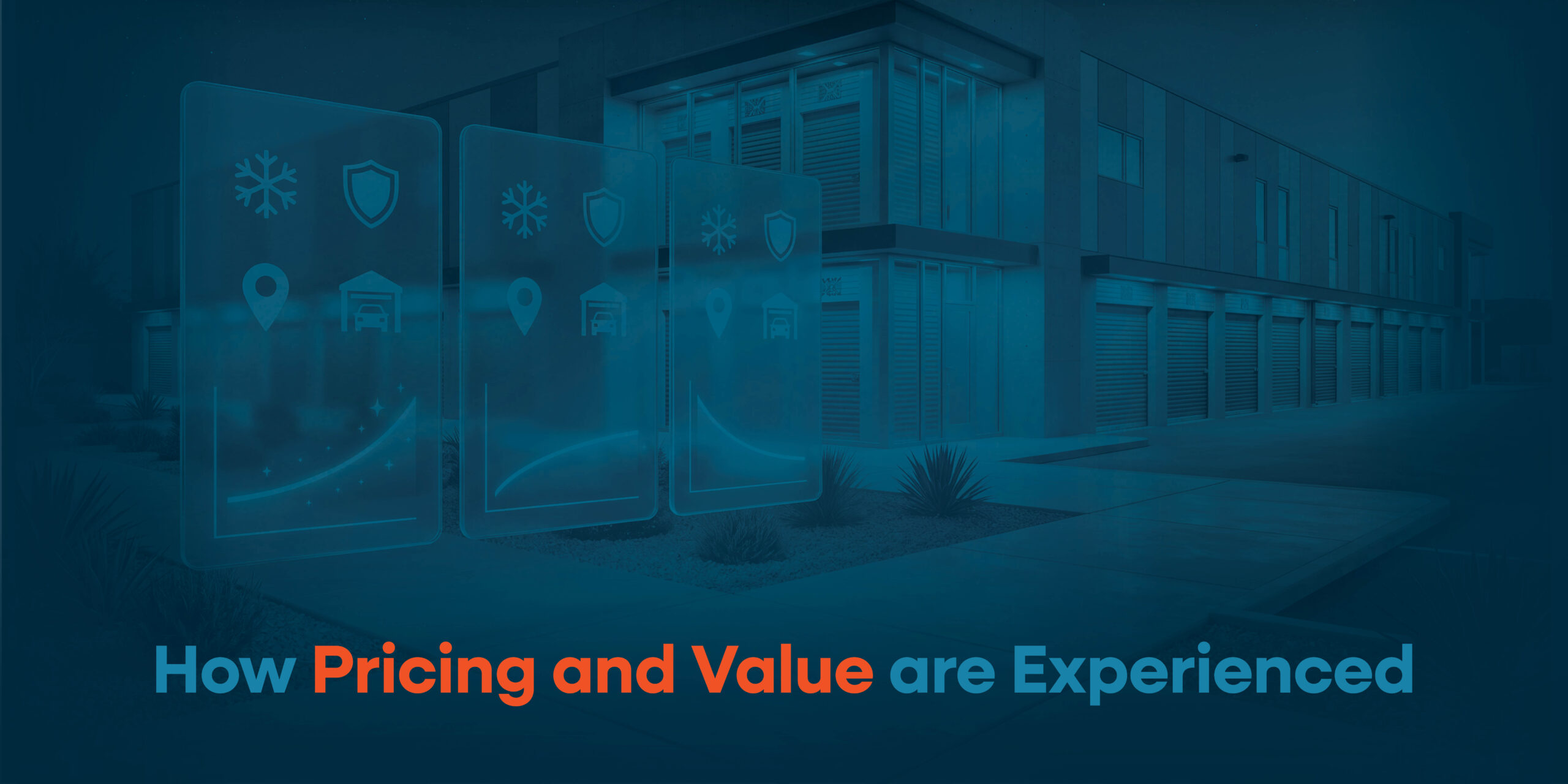
It’s not just about what you charge for a 10×10, but how it’s presented. Prioritize clarity over confusion by displaying transparent prices, promos, and communicating perceived value. Trust is linked to decision speed and conversion—a sentiment that’s echoed in Baymard’s reasons for cart abandonment.1
Features like value-based pricing focus on what the unit is worth to the tenant, not just the square footage, taking into account factors like convenience, security, and overall experience. Value-based pricing is a double win: tenants feel like they’re getting the best customer service, and you increase revenue. When the website clearly shows what drives the price, like drive-up access, climate control, or a more convenient unit location, it replaces hesitation with understanding.
Understanding is what keeps renters moving forward instead of opening three competitor tabs “just to compare.”
Your storage facility website needs to effectively connect pricing and value without making renters feel like they need a decoder ring to figure it out. Nobody should have to click through multiple pages to find affordable storage units, wondering why some unit sizes are more expensive than others, or whether “premium” means better or just more expensive for mysterious reasons.
Clear, conversion-focused pricing should:
- Show the full price upfront, including promos and fees, without surprises later.
- Explain why price differences exist between units.
- Highlight value drivers like location, access, and features in context.
- Make comparisons easy, so renters don’t have to do the mental math.
- Reinforce urgency when pricing or availability is time-sensitive.
When value is made obvious, pricing feels justified rather than questionable. Once pricing feels justified, the decision gets a lot simpler.
Your self storage website should be built to clearly display pricing, and you should be able to make quick, convenient changes to reflect your current market.
Storage Facility Website FAQs
What should I look for in a self storage website provider?
Look beyond features and focus on performance. A good website provider should help you continuously optimize your storage website, improve conversion rates, and adapt to changing market conditions. The goal isn’t just to launch a website; it’s to maximize revenue over time.
What sets Storagely websites apart?
As more providers offer the same “table stakes” website features, the real difference comes down to how those capabilities are configured and optimized to perform. That is where Storagely takes a different approach, treating your storage website as a revenue system that is continuously refined to convert more renters. From how pricing is experienced to how renters move through the rental flow, every element is intentionally built to increase conversions and drive revenue.
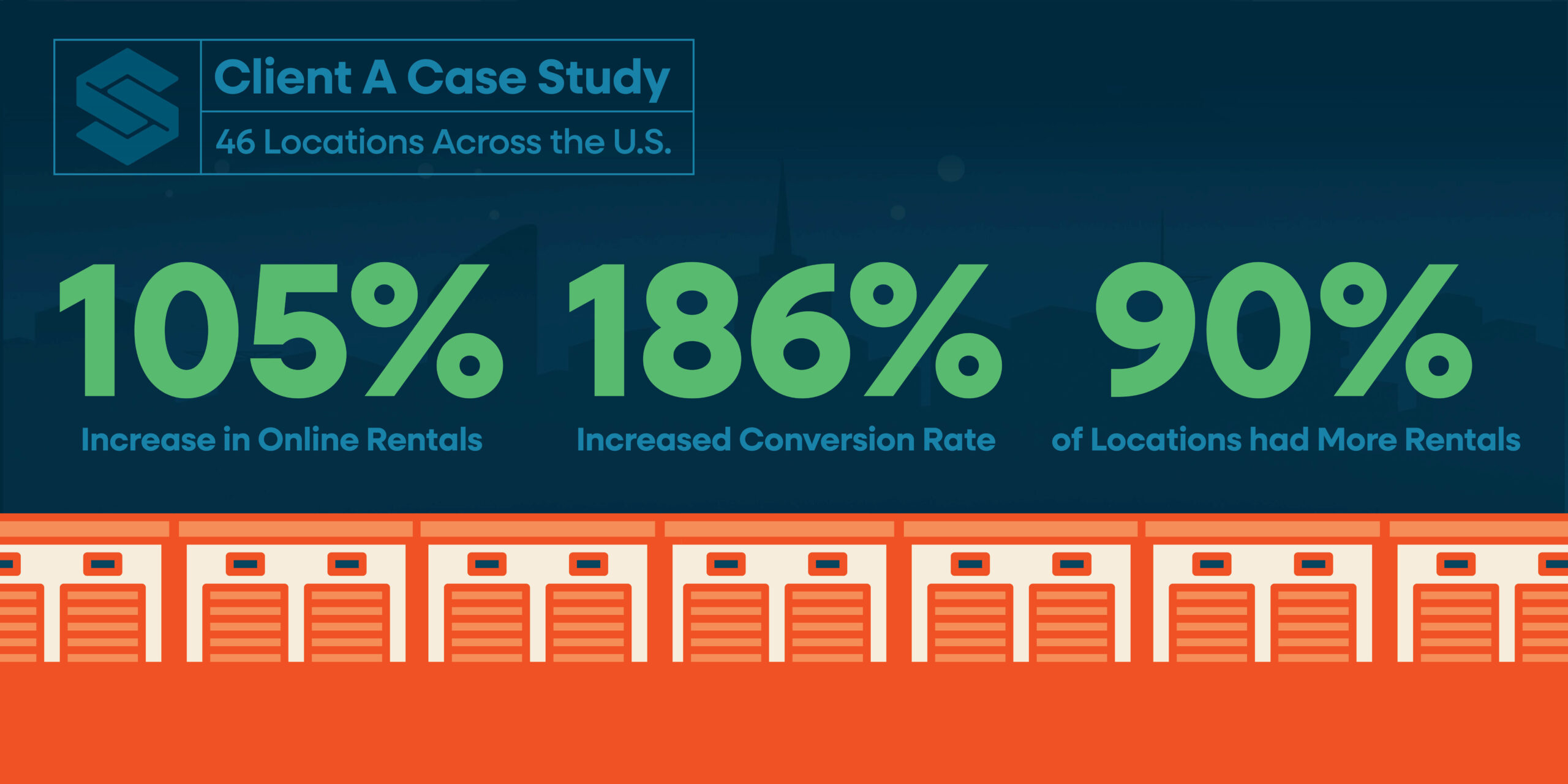
The proof? Our Case Studies support this claim. Client A, a 46-facility storage company, achieved a 186% increased rate of conversion and a 105% increase in rentals within the first six months of switching to a Storagely website. We’re not just a website vendor, we’re your partner who relentlessly strives to improve your website performance using the latest industry data and renter behavior insights to increase customer conversions and drive more completed rentals.
How important is mobile optimization for self storage websites?
Mobile optimization is critical. Most renters search for and compare storage options on their phones. A mobile-friendly self storage website ensures renters can easily browse units, view pricing, and complete a rental without frustration, which directly impacts conversion rates.
Should a storage facility website be updated regularly?
Yes. A high-performing storage website is not a one-time project. It should be continuously optimized based on renter behavior, market trends, and performance data. Regular updates help improve conversion rates, refine pricing strategies, and keep the experience aligned with evolving expectations.
Ready to turn your website into a true revenue driver?
Storagely websites are built to do more than look good or check the box on features.
They are continuously optimized to improve conversions, reduce friction, and maximize rental revenue over time. If you’re ready to see how your storage facility website can perform when every element is continuously refined for conversion, connect with the Storagely team today!
References
- Baymard Institute. (2025). 50 cart abandonment rate statistics 2026 – cart & checkout – baymard. https://baymard.com/lists/cart-abandonment-rate
- Retainful. (2025). Abandoned Cart Recovery Emails: Retainful knowledge base. https://help.retainful.com/automations/abandoned-cart-recovery-email-campaign
- Scott, E. (2024, June 26). Checkout optimization: Minimize form fields – baymard. Baymard Institute. https://baymard.com/blog/checkout-flow-average-form-fields
Read More from Storagely:
- Self Storage Industry in 2026: How Operators Can Win in Today’s Climate
- What Self Storage Operators Are Prioritizing in 2026
- Why “Free” or “Included” Online Storage Websites Cost Operators Revenue